Presentation and Graphics
Presentation
This checkpoint was relatively easy since most of the graphics had already been designed and implemented. However, the game has evolved as I progressed, despite the fact that the majority of the graphics were already in place. The player graphics have remained the same since the first devlog, "Game Concept." The presentation of Skate to Home has been consistent throughout its development, although not all of my original ideas were followed. The initial idea was to maintain the style of many other popular platformer games
I modified the entirety of the game's background to fit the platformer genre and also incorporated a scoring zone that is activated when the player collects a coin
Most of the graphics in the game were found online (see Credits)
Graphics
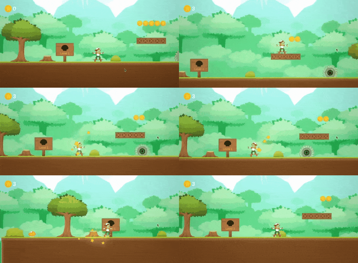
Similar to the presentation, I did not use many placeholders for the graphics. I had all the key graphics up and running very early on and they have changed very little since then, with the main change being the background which originally did not suit the platformer genre. The major shift in graphics probably occurred after the first week of Skate to Home's development, when I was implementing the main player movement (see Picture 1 and Picture 2)

Picture 1: Change from original place-holder graphics, straight to what current graphics are

Picture 2: Example of the player moving animation and its particle effect when it moves
Feedback
Looking good! I'd suggest maybe turning down the volume of the player jumping, its a bit loud and contrasting with the background (mainly in the peaceful outdoor scenes!). Graphics are looking really nice!
Thank you kindly. Yeah, until this stage, I noticed I haven't made any settings screen to adjust the volume. After this devlog, I might add 2 volume settings: 1 is the jumping sound and the second one is the background music.
looking pretty good! i think its a bit much that the stars appear every time you move, i think some kind of dust kicking up would make more sense. One thing i think can be improved is its not clear when the levels are going to end because the goal never looks the same. sometimes im not sure the goal has a sprite or not
Thanks, heaps, after the previous devlog, I have added the particle whenever the player is moving (see Picture 2) but it seems like too much. And the goal for every level will be changed accordingly to the background theme to make the game more challenging.
i found the same issue in level 5 that lindsay found but when you try to move, it pushes you to the left and ultimately kills you. Other then that, the game is very fun and cannot wait to keep playing
Thanks mate for that comment, that is very interesting because I didn't find that issue when I implemented this version. Other than that, I will try to fix this issue and not make it into a feature lol
In level 4, I died on the first saw blade, but when you respawn, the blade does not. When you start level 5, the player spawns in just under the platform, so it looks like they are hovering for a moment before it corrects itself. To be honest, at first I thought it was going to be a hoverboard level, given the theme - which would have been awesome anyway. I'm loving the music and graphics. It is coming together so well!
Thank you for your comment. I appreciate it. You have pointed out several issues that I didn't notice initially, and I agree that they need to be fixed.
Overall, I am quite proud of myself for how well things have come together up to this point.Implementation
In this version, I only used cacti as decorative objects, not obstacles anymore, because many people gave feedback that they were too difficult to distinguish. I also adjusted the delay time after the resurrection to be faster, so players don't have to wait to move and can move immediately. I added a trail when moving, blood when dying, and increased the character's alpha from 0 to 1 when spawning. When collecting coins, players can also see the amount in the top left corner of the screen
Plan for improvement
- Adding a settings screen, a high score screen
Credits
Player sprite: https://creativemarket.com/Silpin/109030-Skater-Boy-Game-Sprite
Background music: https://assetstore.unity.com/packages/3d/vehicles/karting-microgame-urp-150956#content
Tilemap: https://www.gameart2d.com/free-platformer-game-tileset.html
Files
Skate To Home
| Status | Released |
| Author | Nickelodean Uzumaki |
| Genre | Platformer |
More posts
- Documentation and User GuideMay 25, 2023
- Polish / UIMay 19, 2023
- Game TestingMay 17, 2023
- Enemies / Interaction / PuzzlesMay 06, 2023
- Basic Level BlockApr 27, 2023
- Player MovementApr 21, 2023
- Concept DocumentApr 13, 2023
Leave a comment
Log in with itch.io to leave a comment.